
Creating a User-Friendly Website Navigation: Best Practices and Examples
This article aims to provide readers with the best practices and examples of creating user-friendly website navigation. It will cover the key elements of a user-friendly website navigation, such as simplicity, consistency, and ease of use. Additionally, the article will provide some practical tips for designing an effective website navigation system, including how to organize information, use clear labeling, and incorporate visual cues.
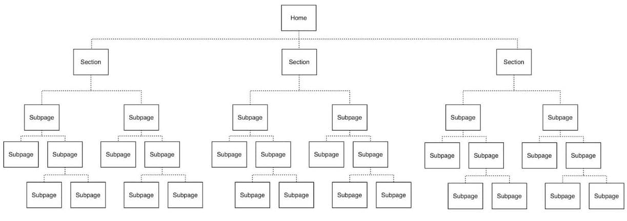
The body of the article will begin by defining the concept of website navigation and its importance in improving user experience. It will then explore the key principles of effective website navigation, including simplicity, consistency, and ease of use. The article will also provide some practical tips for creating a user-friendly website navigation, such as organizing information into clear categories, using clear labeling, and incorporating visual cues like icons and hover effects.
import React from 'react';

const Navbar = () => {
  return (
    <nav className="bg-gray-800">
      <div className="max-w-7xl mx-auto px-4 sm:px-6 lg:px-8">
        <div className="flex items-center justify-between h-16">
          <div className="flex items-center">
            <div className="flex-shrink-0">
              <img className="h-8 w-8" src="/logo.svg" alt="Logo" />
            </div>
            <div className="hidden md:block">
              <div className="ml-10 flex items-baseline space-x-4">
                <a
                  href="/"
                  className="text-gray-300 hover:text-white px-3 py-2 rounded-md text-sm font-medium">
                  Home
                </a>
                <a
                  href="/"
                  className="text-gray-300 hover:text-white px-3 py-2 rounded-md text-sm font-medium">
                  About
                </a>
                <a
                  href="/"
                  className="text-gray-300 hover:text-white px-3 py-2 rounded-md text-sm font-medium">
                  Contact
                </a>
              </div>
            </div>
          </div>

          <div className="hidden md:block">
            <div className="ml-4 flex items-center md:ml-6">
              <button
                type="button"
                className="p-1 border-2 border-transparent text-gray-400 rounded-full hover:text-white focus:outline-none focus:text-white focus:bg-gray-700"
                aria-label="Notifications">
                <svg
                  className="h-6 w-6"
                  stroke="currentColor"
                  fill="none"
                  viewBox="0 0 24 24">
                  <path
                    strokeLinecap="round"
                    strokeLinejoin="round"
                    strokeWidth="2"
                    d="M15 19l-7-7 7-7"
                  />
                </svg>
              </button>
              <div className="ml-3 relative">
                <div>
                  <button
                    type="button"
                    className="flex text-sm border-2 border-transparent rounded-full focus:outline-none focus:border-white"
                    id="user-menu"
                    aria-label="User menu"
                    aria-haspopup="true">
                    <img
                      className="h-8 w-8 rounded-full"
                      src="/avatar.jpg"
                      alt="Avatar"
                    />
                  </button>
                </div>
              </div>
            </div>
          </div>

          <div className="-mr-2 flex md:hidden">
            <button
              type="button"
              className="inline-flex items-center justify-center p-2 rounded-md text-gray-400 hover:text-white hover:bg-gray-700 focus:outline-none focus:ring-2 focus:ring-inset focus:ring-white"
              aria-expanded="false">
              <span className="sr-only">Open main menu</span>
              <svg
                className="block h-6 w-6"
                xmlns="http://www.w3.org/2000/svg"
                fill="none"
                viewBox="0 0 24 24"
                stroke="currentColor"
                aria-hidden="true">
                <path
                  strokeLinecap="round"
                  strokeLinejoin="round"
                  strokeWidth="2"
                  d="M4 6h16M4 12h16M4 18h16"
                />
              </svg>
              <svg
                className="hidden h-6 w-6"
                xmlns="http://www.w3.org/2000/svg"
                fill="none"
                viewBox="0 0 24 24"
                stroke="currentColor"
                aria-hidden="true">
                <path
                  strokeLinecap="round"
                  strokeLinejoin="round"
                  strokeWidth="2"
                  d="M6 18L18 6M6 6l12 12"
                />
              </svg>
            </button>
          </div>
        </div>
      </div>
    </nav>
  );
};

export default Navbar;
In addition, the article will showcase some examples of websites that have successfully implemented user-friendly navigation systems. These examples will include a range of websites, from e-commerce to news sites, and will demonstrate how different organizations have tailored their navigation systems to meet the needs of their users.